SHAKE A LEG
Team: Melissa Gutierrez, User Experience Designer
Carolina Diaz, User Experience Designer
William Sun, User Researcher
Kim Grinfeder, Project Manger
Nicole Barba, Developer
Client: Shake A Leg

BACKGROUND
Shake-A-Leg Miami’s mission is to utilize the marine environment to improve the health, education, and independence of children and adults with physical, developmental and economic challenges, in an inclusive community setting.
PROBLEM
Shake -a- Legs processes so far had been through paper. They wanted to evolve and find a more efficient way to recruit members and volunteers., as well as keep track of donations online. How can we design the site so that Shake A Leg can reach it’s goal of switching from a paper system to digital? They wanted to increase visibility and also showcase all of the amazing services Shake A Leg provides it’s members and volunteers.

GOALS
Digitize Archive
Goal is to have a unified system, digital system
Sorting numbers of visitors to organization (how many people visiting had disabilities? how many didn’t? Where did these visitors come from?)
Capturing signatures for consent forms
Making sure the new site is accessible
Contact
Streamline message process so employee’s aren’t bombarded with emails
Privacy
Privacy of confidential data
Easy payment system (consistent throughout) that would facilitate transactions
Forms that will capture signatures
Keep track of donations
IDEATION
After interviewing both members and faculty of Shake A Leg, we understood that digitizing the paper system was at the forefront of their goals. Members and employees also wanted to show what SAL is and what they do had to be evident. They expressed importance in showing both the activities and the testimonials of current members was crucial in showcasing the unique services offered at the organization.

INTERACTION DESIGN


WIREFRAMES

USER TESTING
Using the lo-fi wireframes, we conducted a usability study. Overall, there were high completion rates and quick completion times. Even though there was an improvement from previous image to text contrast, users thought more contrast on between image and text would be helpful .
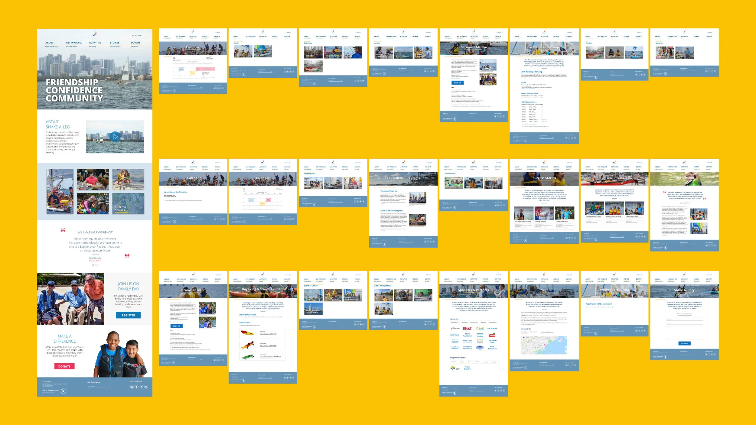
FINAL DESIGN
Incorporating our findings from our meetings with SAL staff and members and user testing, the final design reflected an visually driven site that showcased the unique capabilities of SAL.