Drinkfinity.com
Role
Interaction Designer
Team
Interaction Designer, Product Manager, 3 Engineers, Design Manager
Timeline
3 Months
Client
Drinkfinity
Drinkfinity was a PepsiCo venture that enhanced your water with nutritious ingredients and delicious pod flavors while eliminating disposable bottles. In my role as a Designer for Drinkfinity, I crafted the user experience of Drinkfinity.com, incorporated a refreshed visual direction in all print and digital media, and worked within a cross-functional team to ensure brand cohesiveness across user experiences and visual design.
Problem
The previous iteration of the Drinkfinity bottle was a reusable plastic bottle. We heard feedback from customers that while they enjoy the concept, they would benefit more from a bottle that would keep their beverages cold longer throughout the day. With a new bottle andbranding strategy in hand, I was tasked with updating Drinkfinity.com to reflect a brand-new bottle design and brand direction. Our main challenge was understanding how to communicate the new bottle features and new flavor benefits to both subscribed and new customers with the site redesign.
How do we streamline the online experience for customers while simultaneously incorporating our new branding direction throughout the website?

Old Drinkfinity Bottle

Old Drinkfinity.com
Improvement Opportunities
To best understand the challenge ahead, we conducted we gathered insights from stakeholders and customers. Based on our findings, we identified two main opportunities for improving Drinkfinity.com. First, customers had issues finding call-to-actions, which in turn made it difficult to move efficiently from browsing to checkout. Second, we found that customers had difficulties navigating and understanding our many beverage and flavor categories. We employed an iterative design process, and took feedback from both stakeholders and customers during our next round design and research.

Old Drinkfinity.com
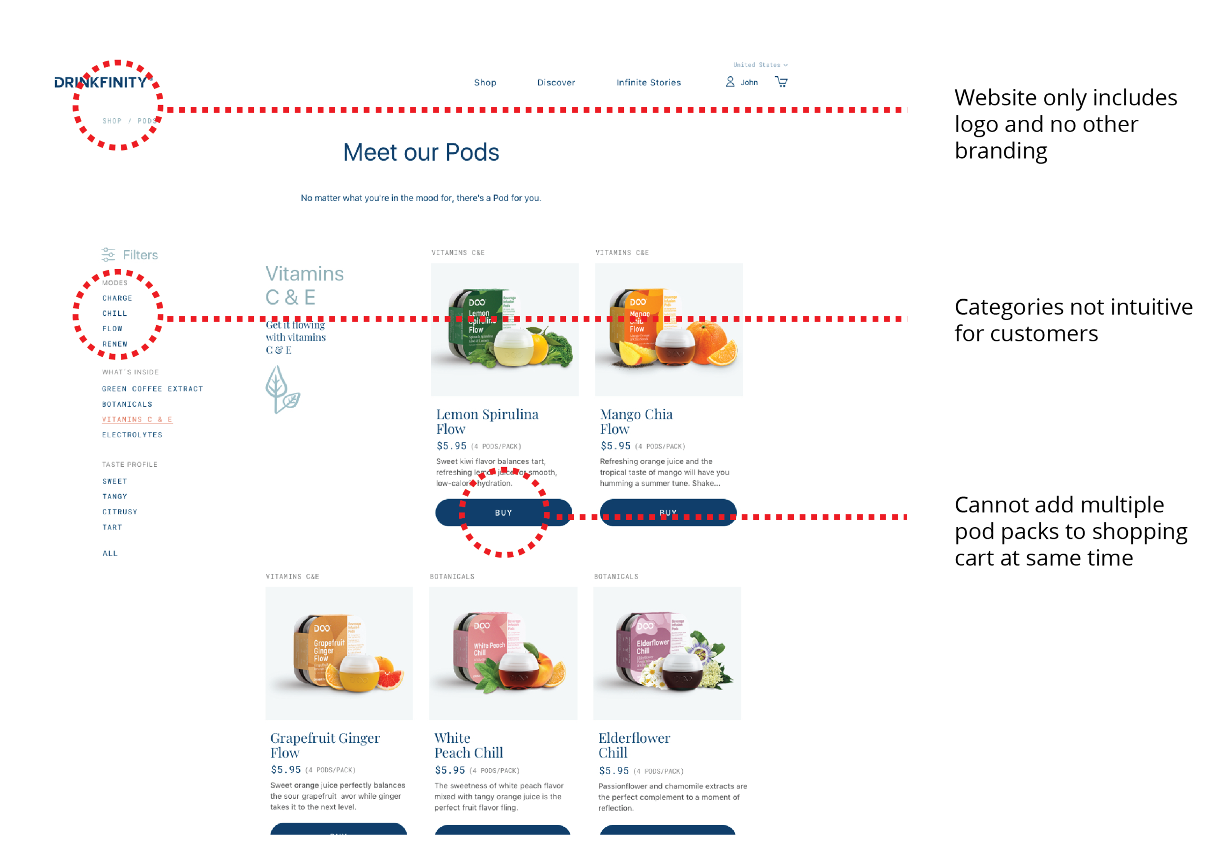
Old Drinkfinity.com
Explorations and Iterations
During the early stages of the website redesign, we drew from the function of the new bottle and the vibrancy of the brand design. Our insights showed that in the previous website design, categories of pods were not descriptive enough and that the website lacked clear branding. We explored novel ways of highlighting the vibrancy of the bottle colors, the new features, as well as the updated benefits of the new pod flavors.


Implementation
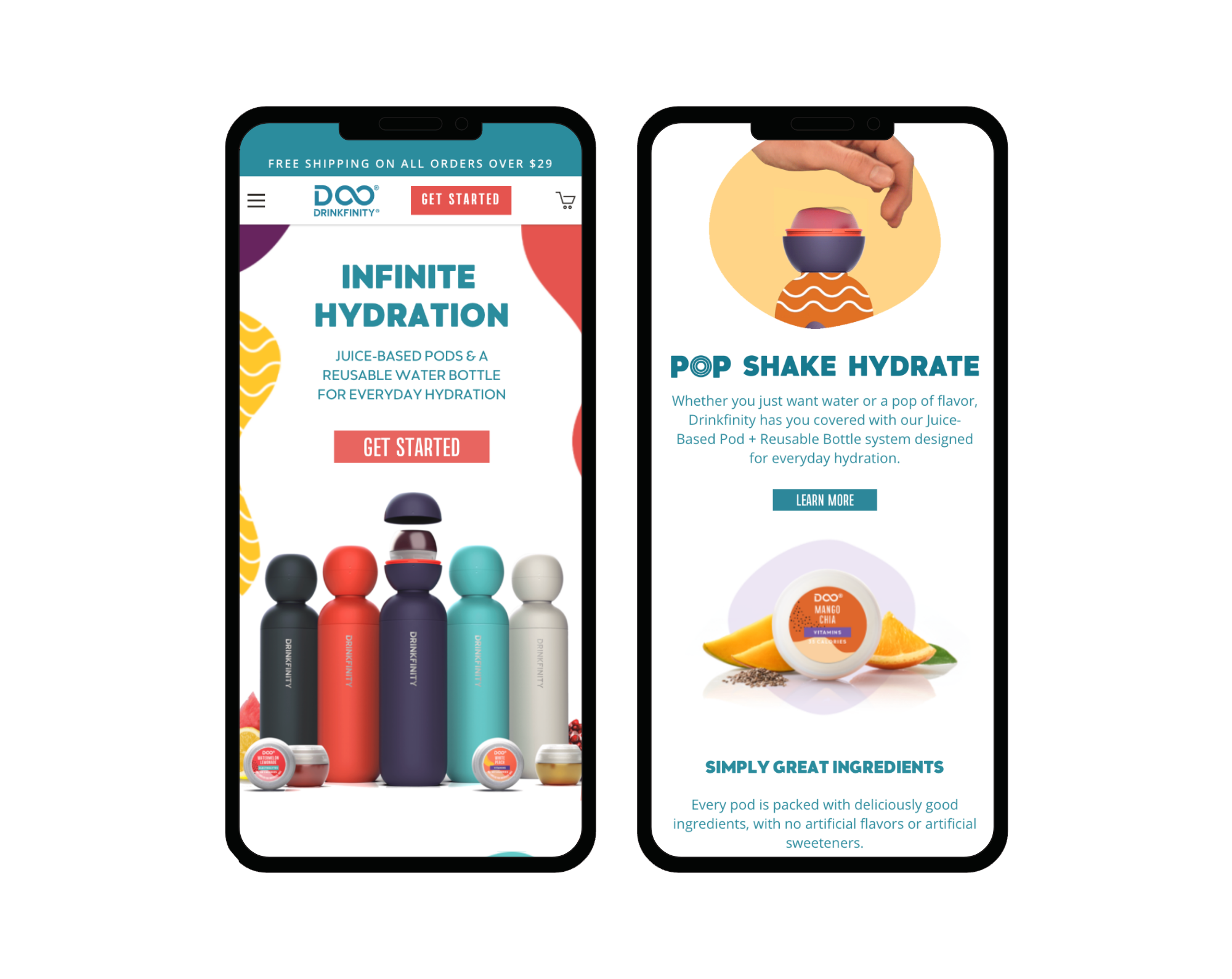
The redesigned page emphasized the bottle's interactivity to stand out in a saturated market and demonstrate its value to both new and existing customers. The initial launch relied on static product photography and lacked motion to convey the bottle's functionality. We updated the landing page to better highlight its interactivity and provide a clearer view of its unique features.

Drinkfinity Redesign

