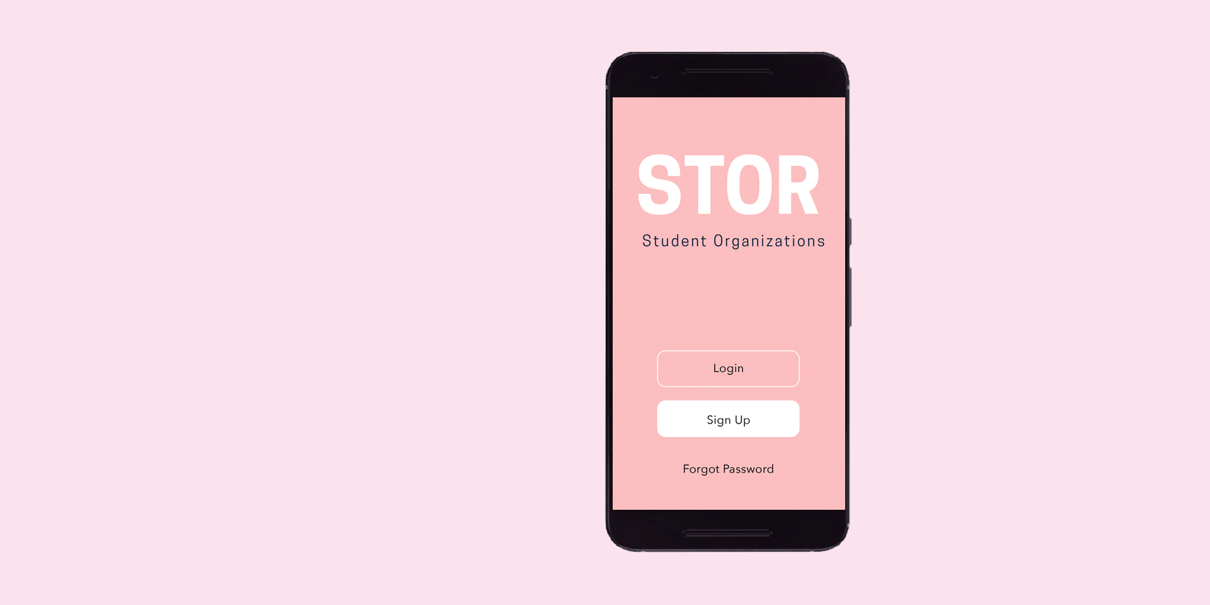
background
It’s a new school year and students want to browse, search, and propose new student organizations. Stor facilitates the student organization process by curating existing groups to student interests while connecting students to current members. Additionally, Stor simplifies the proposal process for students interested in creating their own organization.
PROBLEM
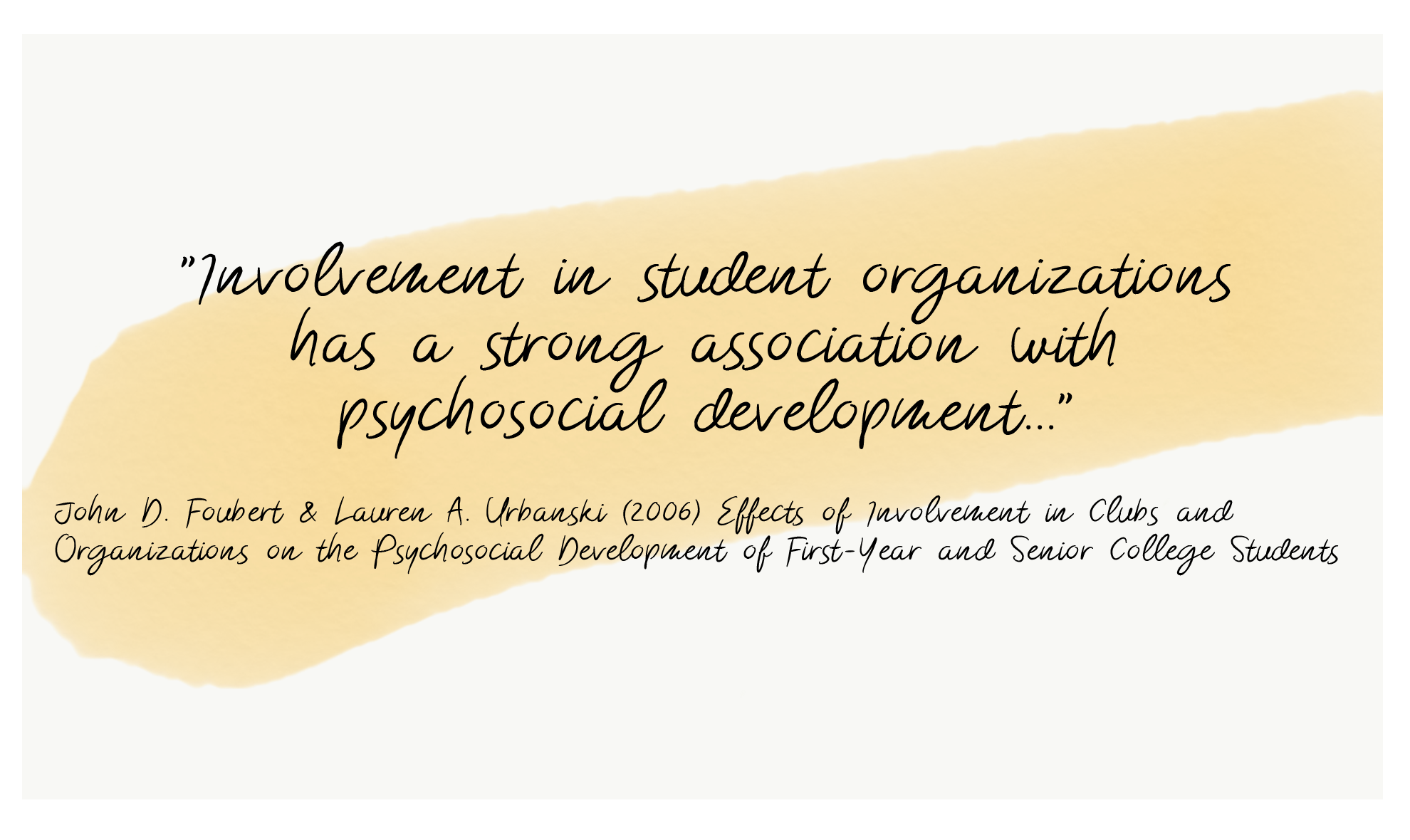
Involvement in student organizations can heavily impact a student’s university experience. However, a student’s ability to familiarize themselves with student organizations available to them is often a disorienting process. How can we make a more user centric approach for students who are either interested in joining an organization or are interested in proposing their own?
PROCESS

RESEARCH | COMPETITIVE ANALYSIS
Conducting a competitive analysis was crucial to understanding how others schools walked students through the organization process. Through this analysis, I was able to detect information overload as a main issue throughout three different college organizations pages. The university sites showcased a large amount of options at the forefront without any clear categorization. These student organization pages also lacked any helpful resources for students who potentially had any questions or would like to learn more about a specific group. Contact information was often not included, and sites lacked the time and date of the next organization meeting.

RESEARCH | interviews
Through my interviews, I was able to understand how current students feel at the student organization process at their school. In my four interviews, students were unaware of where to find information on organizations off campus. The students I interviewed were all interested in joining organizations, but felt confused and overwhelmed at student events where these orgs recruit. The students sought organizations that aligned to their goals and interests, but felt like that connecting and learning more was a difficult part of the process.
Questions I asked:
Are you interested in joining student organizations?
What do you know about your school’s existing organization process?
How do you interact with these orgs?
Do you want to propose your own organization?


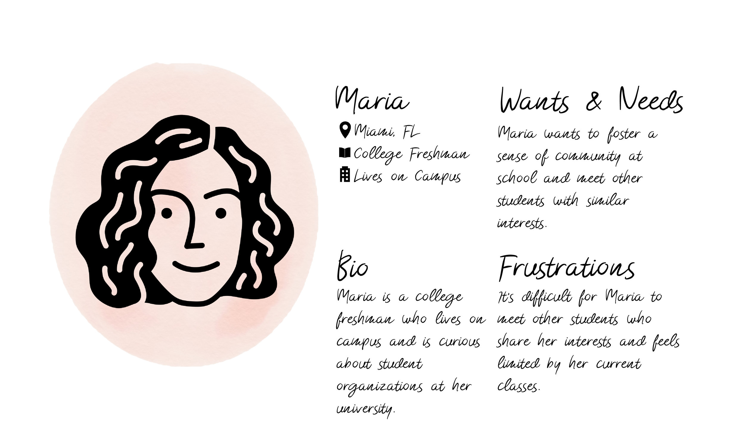
EMPATHY MAP & PERSONA
Through my interviews, I was able to group students’ feelings by categories of what they said, what they thought, what they do, and how they feel. This enabled me to create a persona, Maria, that experiences similar wants and frustrations within trying to find the best student organization for her.

ideation
After interviewing students and creating a persona, I began to understand the type of features Stor should have. I knew that Store should be optimized for mobile because it would facilitate the way students connect and find organizations. Grouping the categories of organizations was something that had to be painless for the user and help guide them instead of burdening them. Through my interviews and empathy map, connectivity was a major pain point for students. Because of this, I believe and option to see current members on the team and have the opportunity to chat with them could be beneficial to a potential new member of an organization.
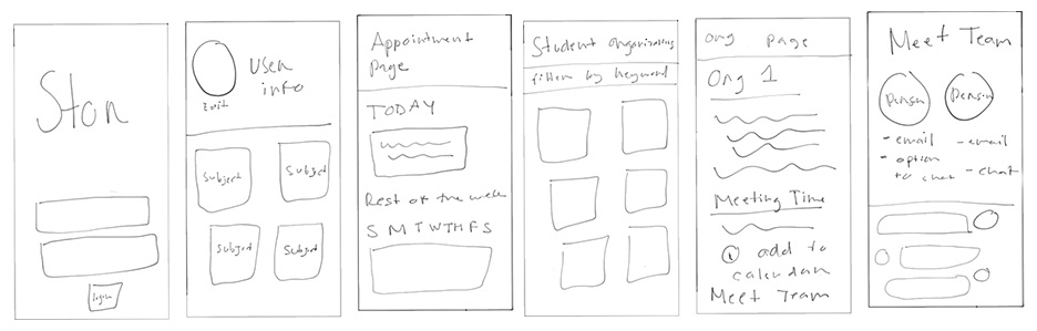
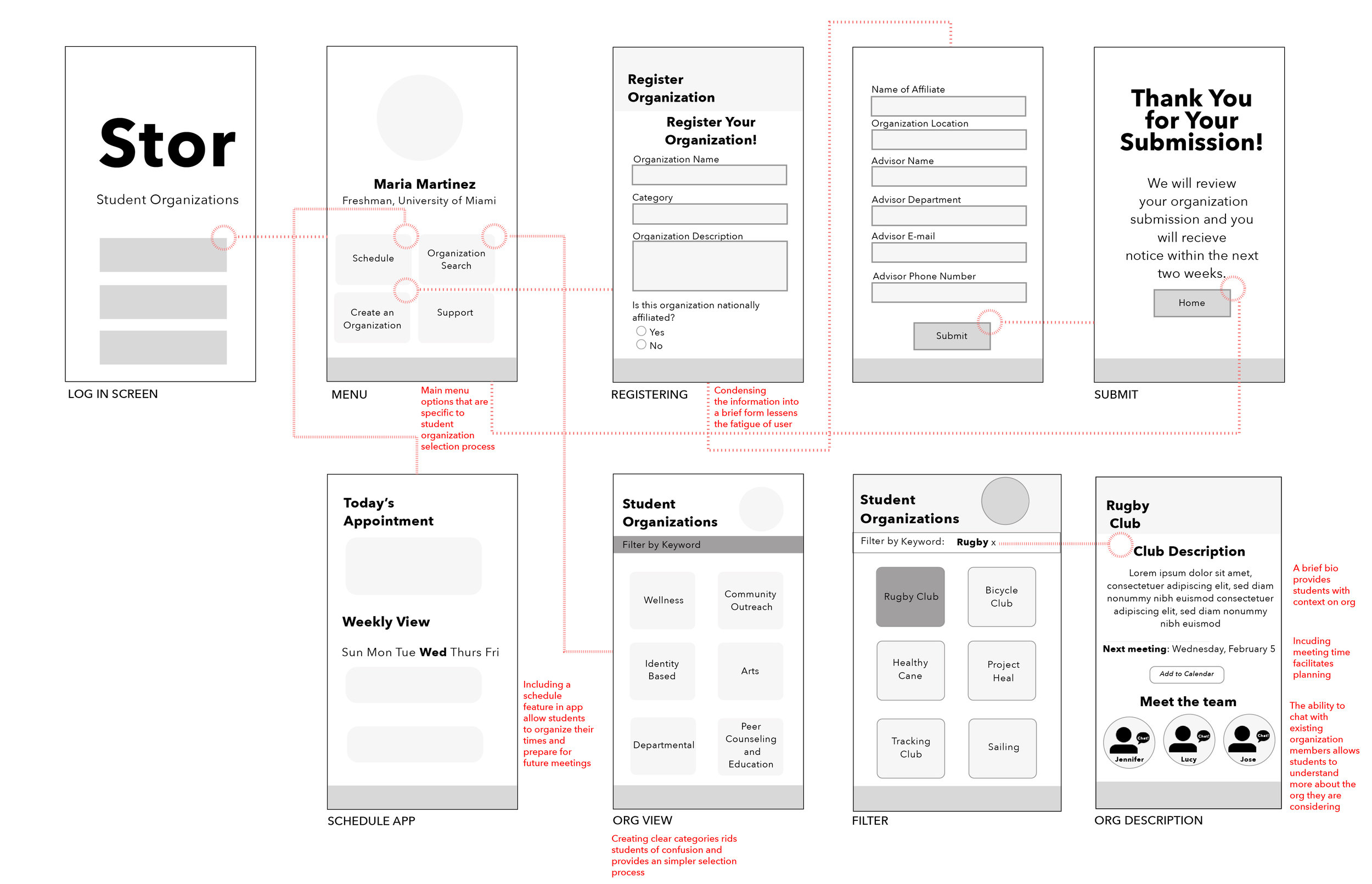
WIREFRAME FLOW
When creating my lo-fi wireframes, I know I had to narrow down the menu options into a selection that would be helpful for students nationwide. Schedule, Organization Search, Create an Organization, and Support were four integral choices that were chosen based on my research.
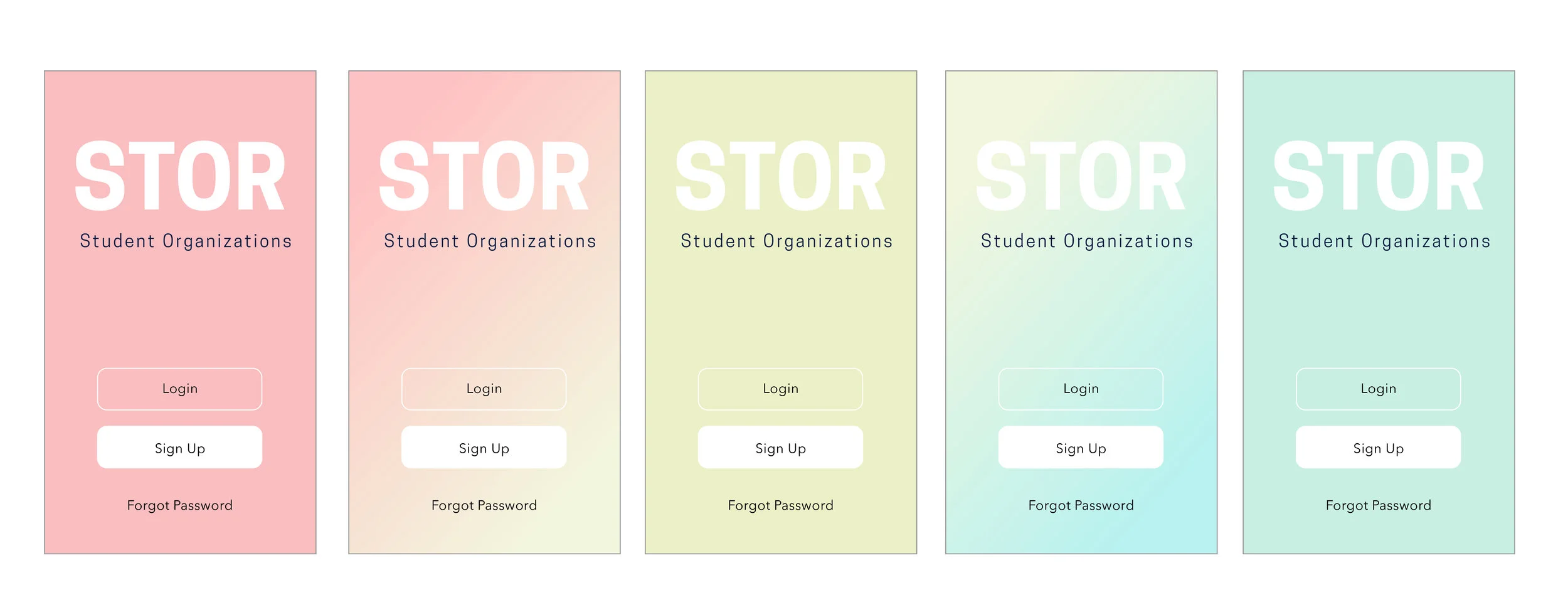
DESIGN EXPLORATIONS
An important aspect of the ‘Stor’ design process was to capture the dynamism of the college experience while providing a clear and accessible form of communication between students and organization. The following explorations represent my process that employed the use of gradients and stylistic typefaces.
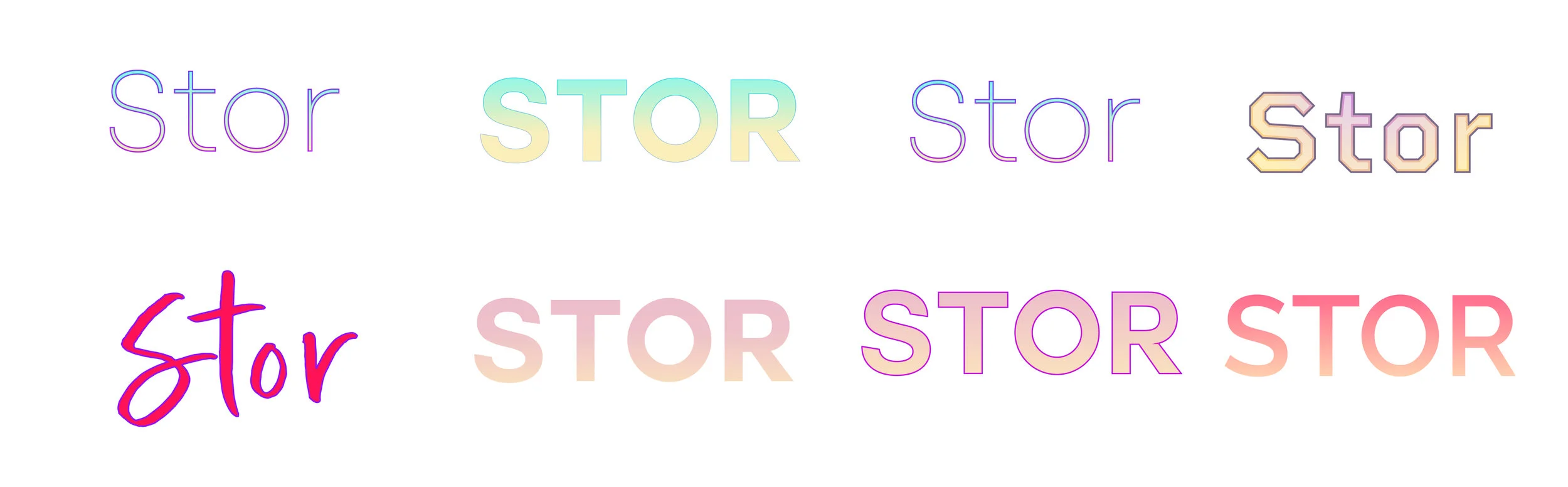
Ultimately, I choose to use the dynamic gradients from my explorations as the home screen of the experience. The color changing background is meant to be soothing yet distinctive. Given the importance of a clear language in creating an accessible experience for users, the full application is limited to one gradient while the dynamic background is used on the home screen.
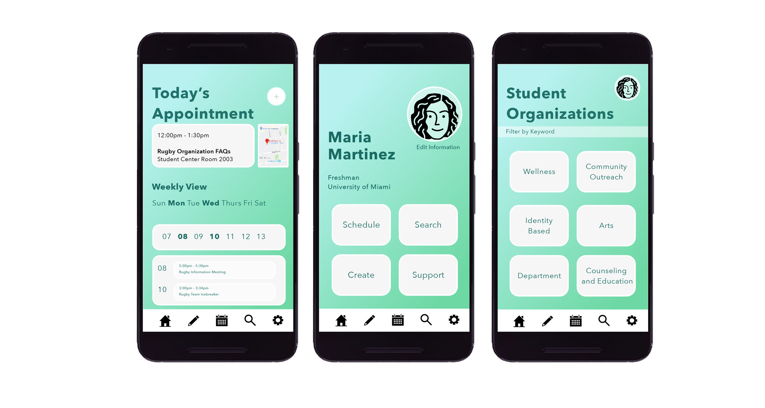
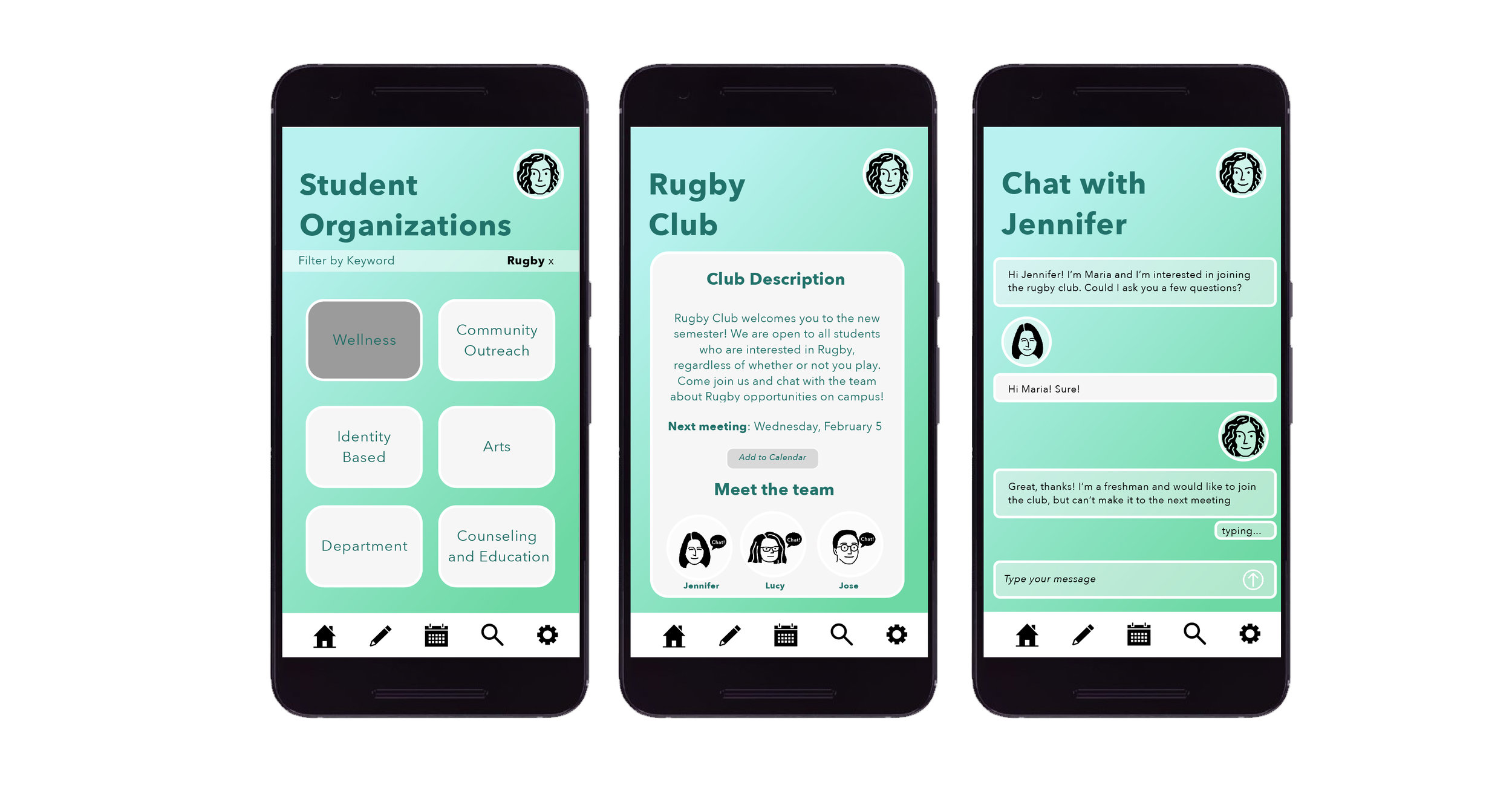
HIGH FIDELITY WIREFRAMES
The full experience uses a soothing green-blue mixture throughout all screens. the rounded corners, white outlines, and consistent footer are meant to provide students with a clear means of communication with organizations and their members.
Prototype
LESSONS LEARNED & NEXT STEPS
Creating Stor gave me a great look into how designing for students can play an integral role in their university experience. Given more time, I would test my high fidelity wireframes and edit according to their feedback on a more refined wireframe. I would also like to test the app on organization leaders and see how they react to the present features.